Buy
Reviews

Overview

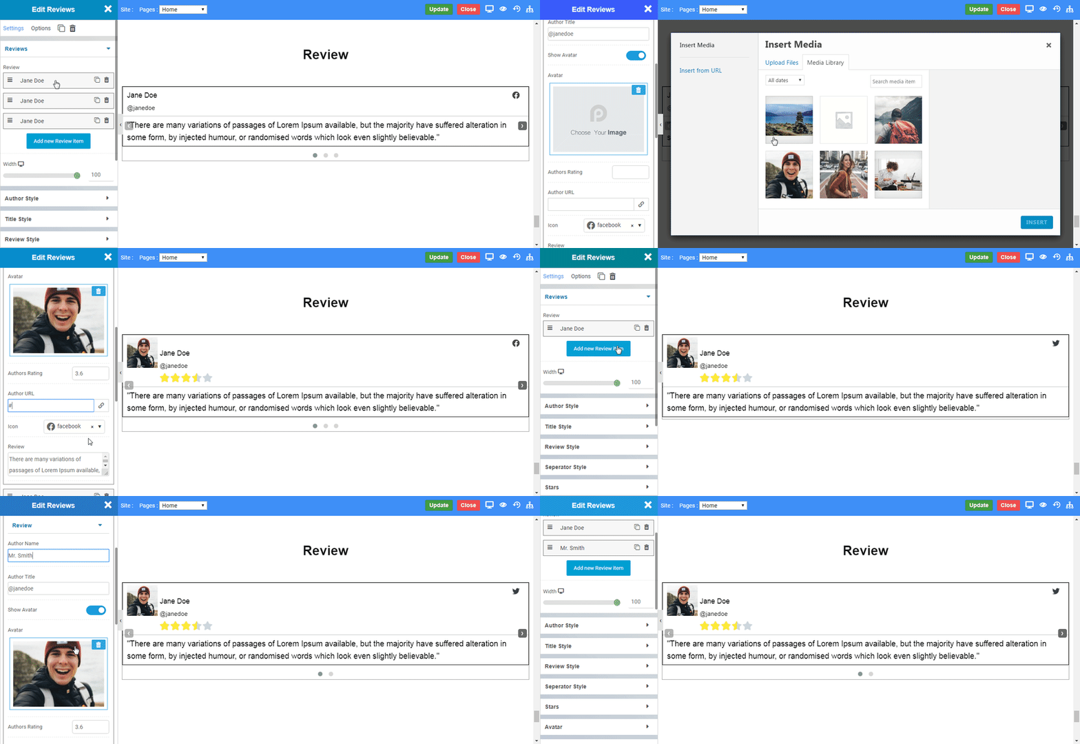
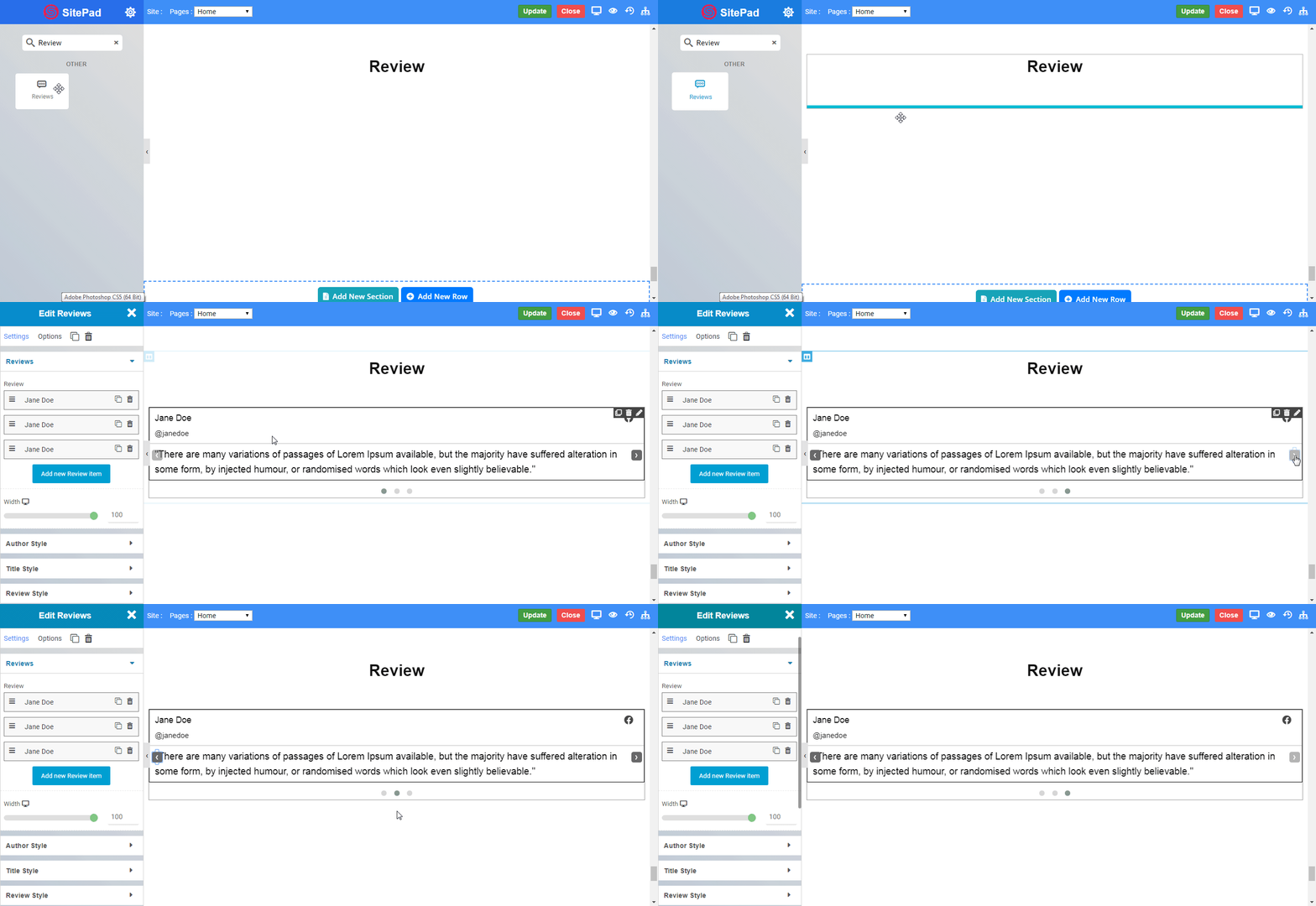
The Review Widget allows you to deliver professional reviews from your clients. You can use stars for rating as it is the most common rating system. You can use it for rating any products. You can set reviewer's photo along with its social profile links.
Review_Overview

Options

Review

  • Author Name : Enter the name of the author you want to display.
  • Author Title : Enter the title of the author you want to display.
  • Show Avatar : Enable the toggle to display author image.
  • Authors Rating : Enter the star rating the author provides by giving max number of stars from 1 to max 10.
  • Author URL : Enter the social profile link of author.
  • Icon : Set the icon according to the social profile link provided.
  • Review : Enter the text of authors review to display. 
  • Add new Review item : Add the number of reviews you want to display by clicking the add new review items and the reviews will be displayed as slider.
  • Width : Set the width in which review is to be displayed.
Review_Reviews

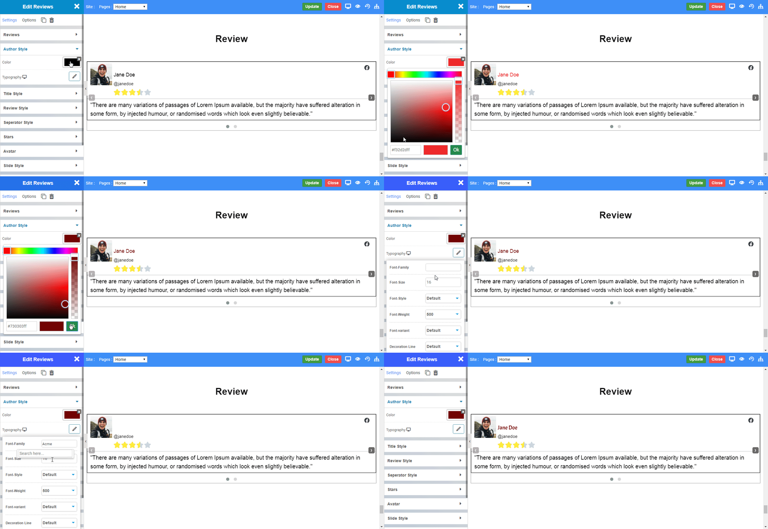
Author Style

  • Color : Choose the color of text you want to display as author name.
  • Typography : Choose the Font-name, size, boldness, text-decoration, letter-spacing.
Review_Author

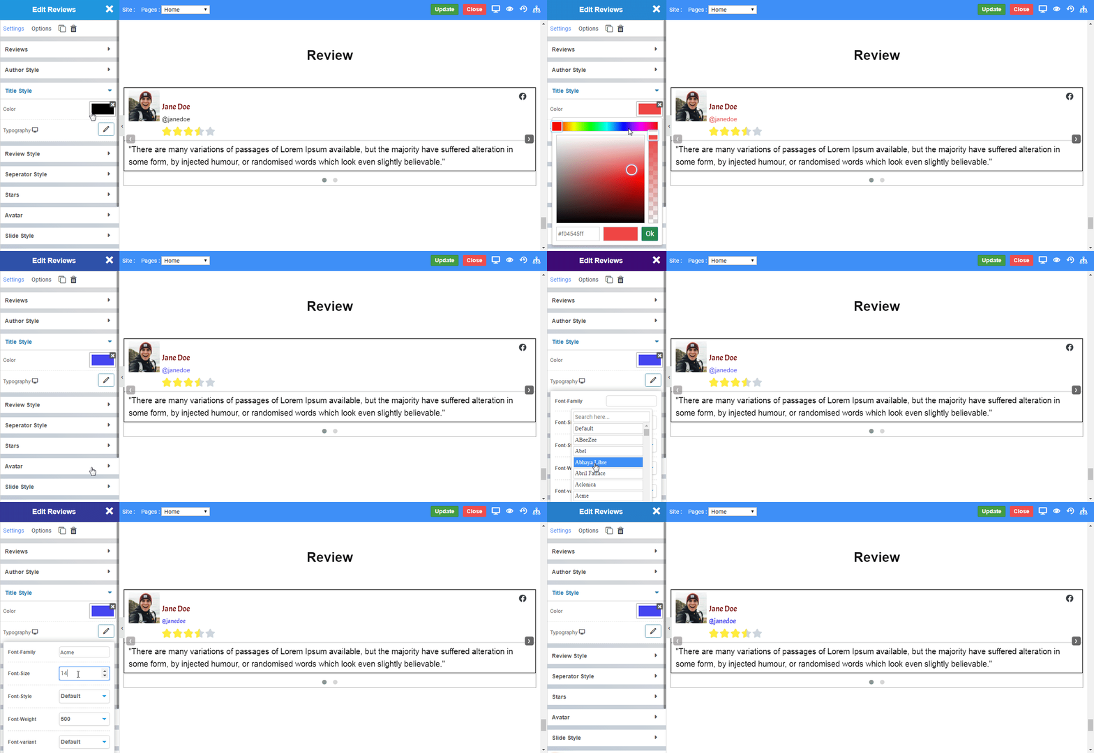
Title Style

  • Color : Choose the color of text you want to display as author title.
  • Typography : Choose the Font-name, size, boldness, text-decoration, letter-spacing.
Review_Title

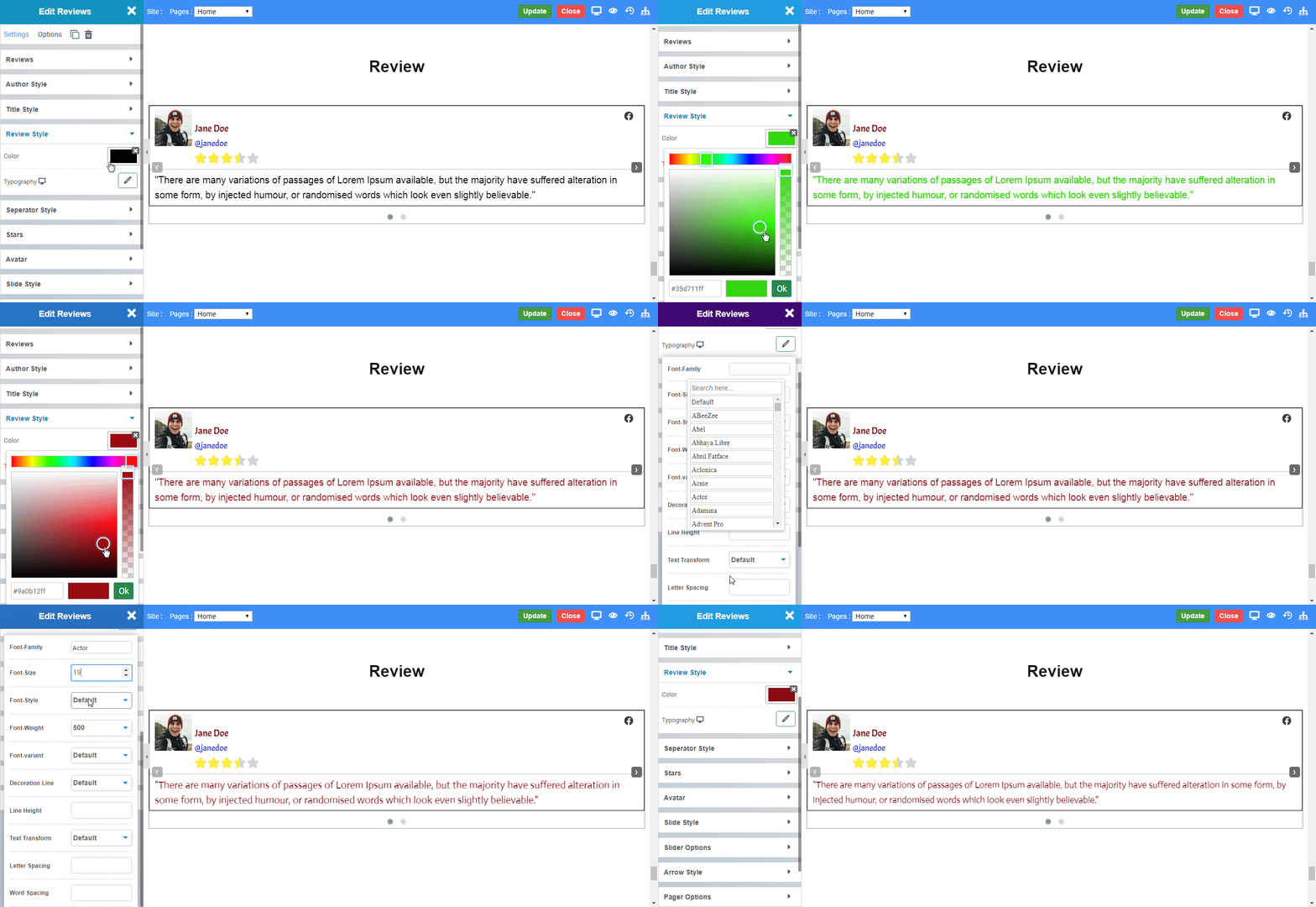
Review Style

  • Color : Choose the color of text you want to display as author review.
  • Typography : Choose the Font-name, size, boldness, text-decoration, letter-spacing.
Review_Review

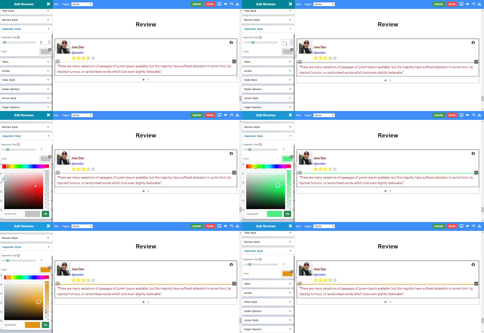
Seperator Style

  • Width : Set the width of seperator.
  • Color : Choose the color of seperator. 
Review_Seperator

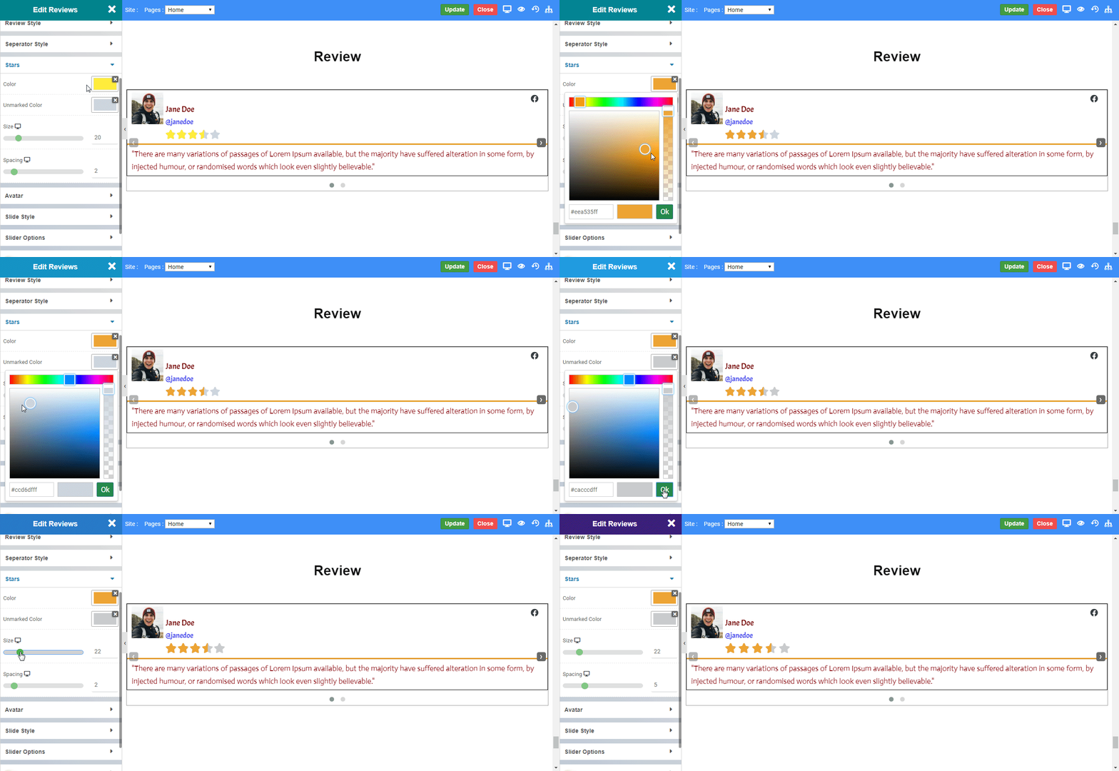
Star

  • Color : Choose the color of rated stars.
  • Unmarked Color : Choose the color of unmarked stars. 
  • Size : Set the size of the star.
  • Spacing : Choose the space between stars.
Review_Star

Avatar

  • Image Size : Set the size of Image you want to display.
  • Border Radius : Set the radius curve to the image displayed.
Review_Avatar

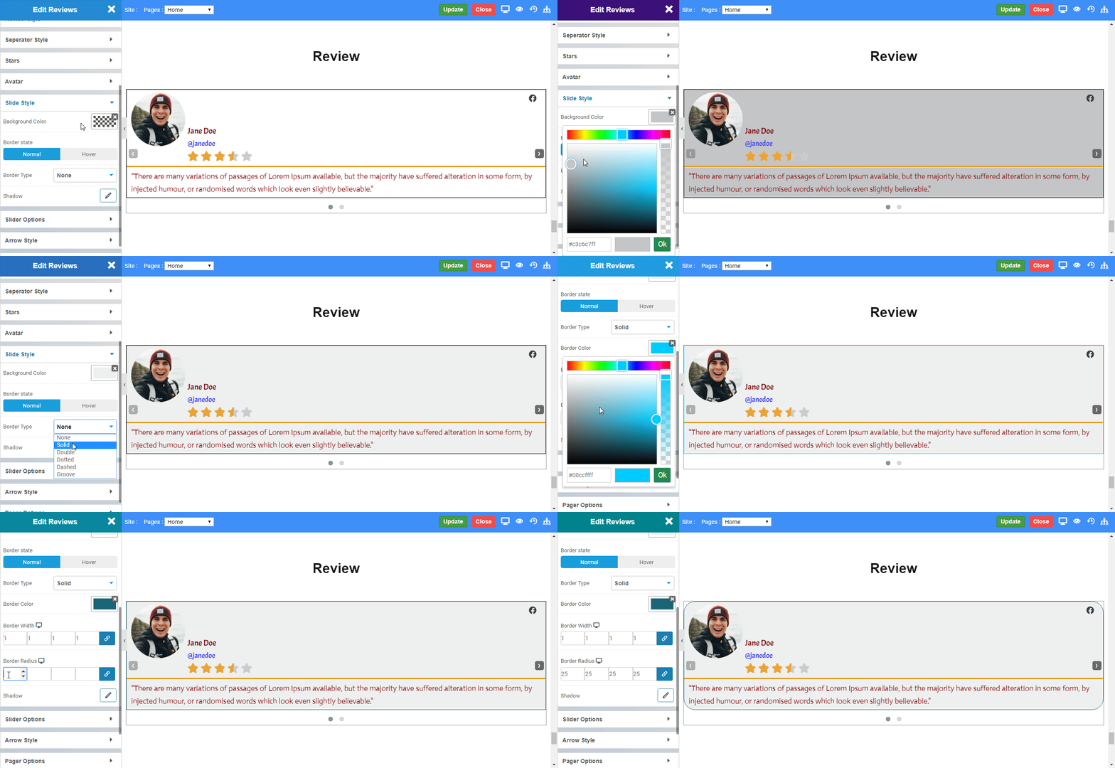
Slide Style

  • Color : Choose the color of rated stars.
  • Border State : Choose the state in which border is to be displayed viz. Normal or Hover.
  • Border Type : Choose the type of border you want from Solid, Double, Dotted, Dashed, or Groove
  • Border Color : Choose the color to the border displayed.
  • Border Width : Set the width of border to be displayed.
  • Border Radius : Set the radius curve to the border displayed.
  • Shadow : Set the shadow to the review widget.
Review_Slide

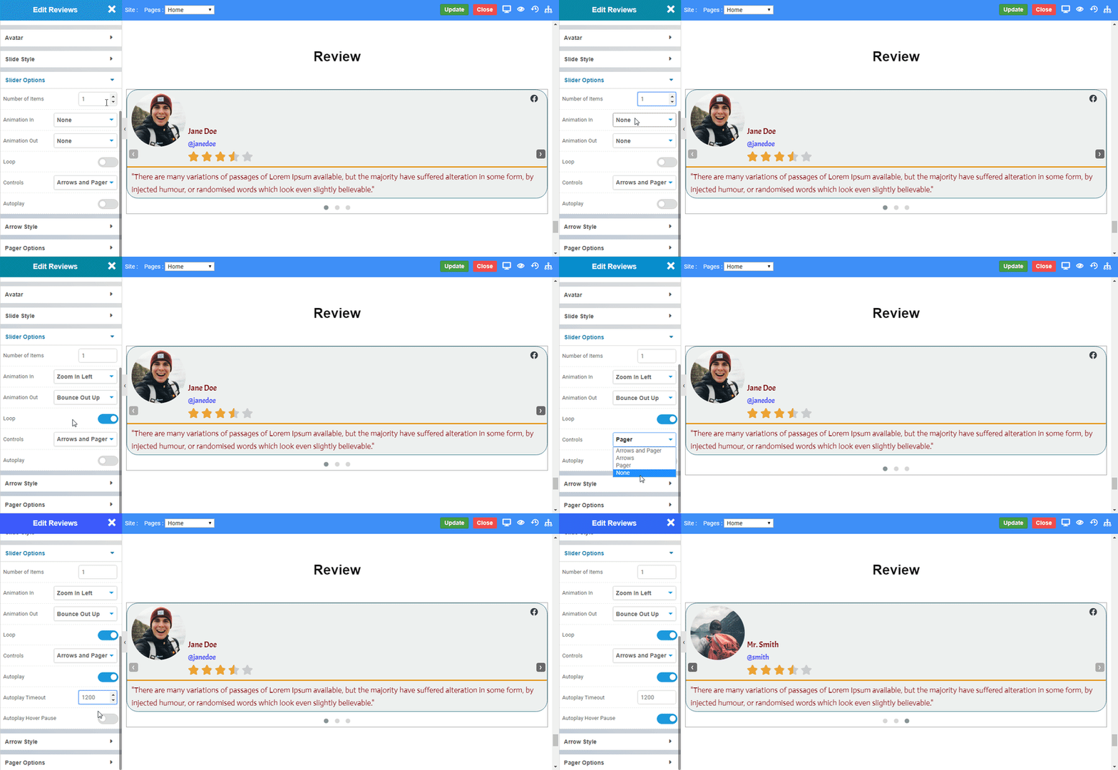
Slider Options

  • Number of Items : Set the number of review items to be displayed at once.
  • Animation In : Choose the animation for inner animation. 
  • Animation Out : Choose the animation for out animation. 
  • Loop : Enable the toggle to loop the reviews.
  • Controls : Choose the controls you want to display viz. Arrows and Pager, Arrows, Pager, None.
  • Autoplay : Enable the toggle to autoplay the reviews.
  • Autoplay Timeout : Set the time period to which autoplay is to be performed. (1000 ms is equal to 1 second.)
  • Autoplay Hover Pause : Enable the toggle to pause the autoplay on hover .
Review_Slider

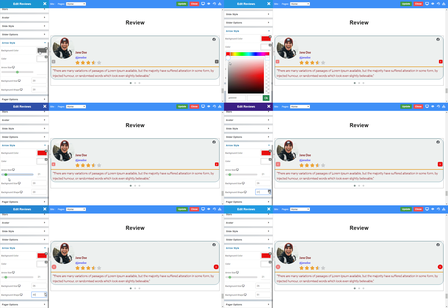
Arrow Style

  • Background Color : To set the background color of arrows.
  • Color: To set the foreground color of arrows.
  • Arrow Size: To define the size of arrows to be displayed on web page.
  • Background Size : To define the background size of arrows.
  • Background Shape : To set the background shape of arrows.
Review_Arrow

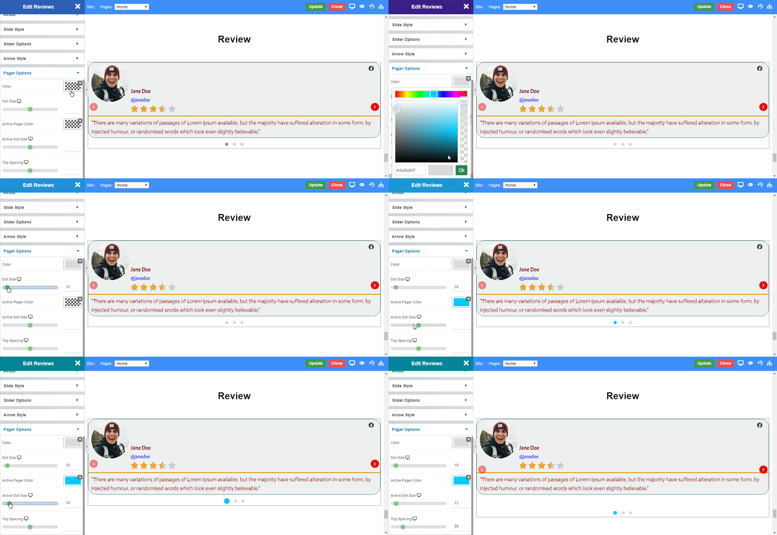
Pager Options

  • Color: To set the color of the pager.
  • Dot Size: To define the size of pager to be displayed on the web page.
  • Active Color: To set the color of the active pager.
  • Active Dot Size: To define the size of the active pager.
  • Top Spacing: To define the Top Space of the pager.
Review_Pager
    Was this page helpful?
    Newsletter Subscription
    Subscribing you to the mailing list