Buy
Accordion

Overview

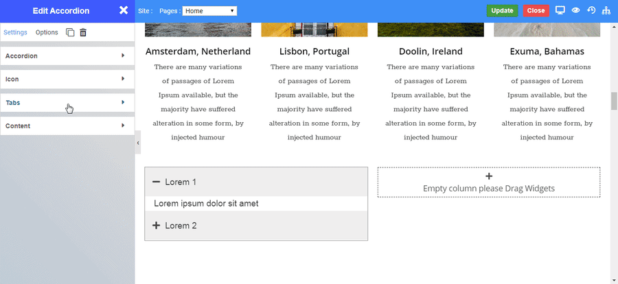
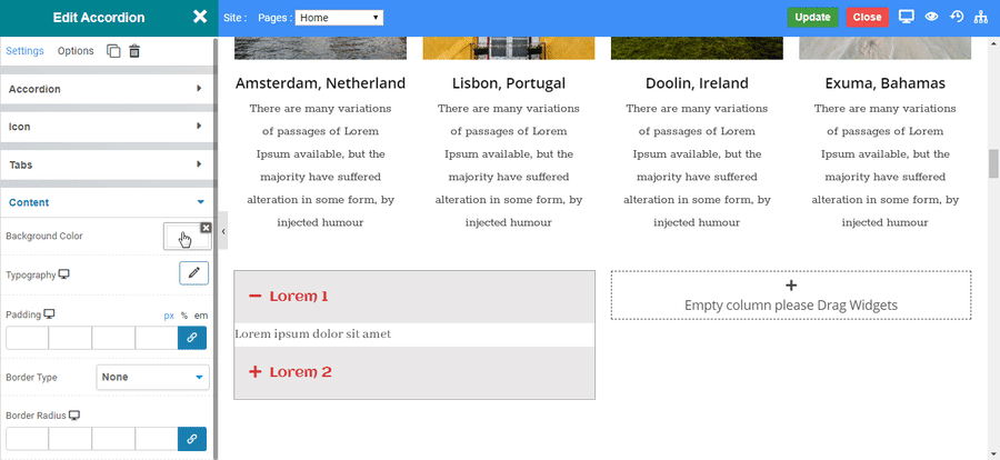
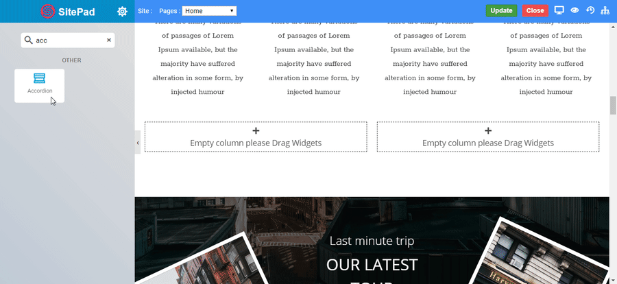
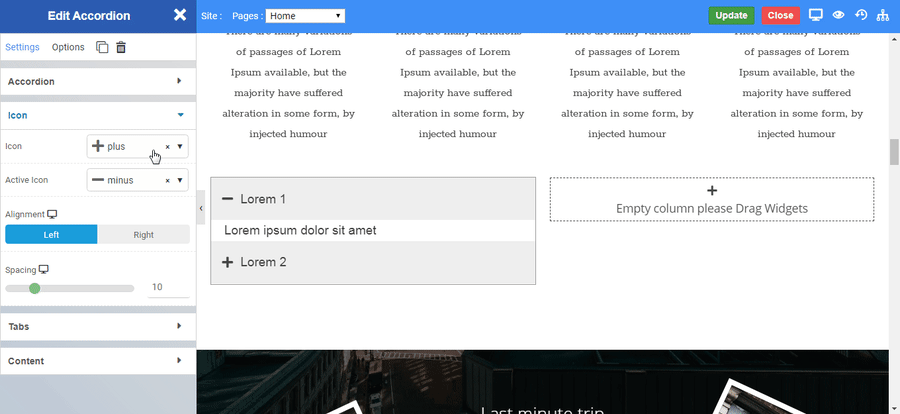
Accordion Widget is used to display text in a collapsed, condensed manner, letting you save space while still presenting an abundance of content.

Options

Accordion

  • Accordions : Add the accordion content you want to display by clicking on Add New Accordion Item.
  • Default Active tab : Enable the toggle to this option to set the active tab.
  • Title : Type the text you want to display as title.
  • Content text : Type the text you want to display inside the accordion CLICK HERE to see the styling of text in this widget.
  • Spacing : Set the exact spacing between two tabs.
accordion

Icon

  • Icon : Set the default icon for tabs.
  • Active Icon : Set the icon for the active tab.
  • Alignment : Set the alignment of the icon.
  • Spacing : Set the exact spacing between the icon and title of the accordion.
accordion_icon

Tabs

  • Color : Choose the default color for the title.
  • Background Color : Choose the default background color for the tabs.
  • Active Color : Choose the color for the title of the active tab.
  • Active Background Color : Choose the background color for the active tab.
  • Inner Space : Set the inside space of the tabs.
  • Typography : Choose the Font-name, size, boldness, text-decoration, letter-spacing.
accordion_tab

Content

  • Background Color : Choose the default background color for the content of tabs.
  • Typography : Choose the Font-name, size, boldness, text-decoration, letter-spacing.
  • Border Type : Select the border type to display.
  • Border Color (Option only available for border type) : Set the color of the border.
  • Width (Option only available for border type) : Set the width of the border in pixel(px) unit.
accordion_content
    Was this page helpful?
    Newsletter Subscription
    Subscribing you to the mailing list